Responsive Web Design in the West Toronto Area
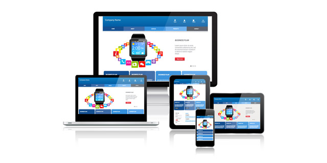
As technology evolves visitors have been adapting to use new media to visit your Internet properties. long are gone the days where the only device used to browse a web page was a PC. Nowadays more than 50% of visitors to web sites use mobile devices. The difference between these devices are mainly screen size and resolution (pixels/inch).
So your web site should have to be able to serve any screen size:
- PCs screens go from 1024 pixels and they will go over 4K soon.
- Tablets Run from 768 pixels to over a Thousand pixels, and
- Smart phones: go usually from 320 pixels to 640 pixels
In both Tablets and Smart phones you should be prepared to serve your content in different type of orientation: portrait, where the user is holding the device with the shortest side parallel to their eyes, or landscape where the user is holding the device with the longest side parallel to their eyes
But there was another problem. Tablets and smart phones use touch interface and web sites were designed only for mouse. No matter your old web site looks "decent" on a tablet it wont perform good as the navigation bar would be in most cases un-usable.
Mobile web site
Initially we start building an additional mobile site so people can be redirected to a mobile friendly site, however this approach has a lot of flaws:
It forces you to maintain two different web site and usually you end up with one of them offering old content.
For large sites you can have only few pages as it would demand a lot of energy to duplicate each page
It usually didn't cover tablets
Responsive Design
Fortunately the technology also brought a great solution, responsive design where one size fits all solution that is actually nothing but one size.
Responsive web design makes it easy for your business to adapt the changed consumer behaviour with minimal effort. All you need is one site that adapts according to the screen size. This means the web site has no standard size but the elements are moved so it’s most comfortable to use no matter what device the users on. The content is always proportional on the screen and the elements rearranged to give the best user experience. Responsive design enables to remove elements from smaller screen and add extra details on desktop view so you can customize the content according to the device used.
Responsive web design offers a great user experience. A fully functional and flexible web site will improve the user experience and attract visitors to stay on the web site. For example, if a customer finds a product on his smart phone he doesn't need to go home and continue researching this product on the main site with different navigation, but he can return on the same page he visited via his smart phone. In addition, responsive site requires no extra SEO for mobile search and is easy to manage on one CMS system.
Responsive web design has many other advantages that make it a smart solution for your next web redesign. Stand out on any platform and offer great user experience that drives your site new clients and turns existing ones into loyal customers.
Advantages of Responsive Design
Responsive web design involves creating only one Web site that automatically reconfigures itself to display differently depending on which device is accessing the site, whether it is a smart phone, tablet or desktop computer. This is often the better choice for your business, for the following reasons:
- There is only one Web site to update, which is more time and cost-effective.
- Google officially recommends responsive web design as its favoured mobile configuration and as the industry best practice. With a 67% search market share, following Google's recommendations is good advice.
- In terms of SEO, having only one site and one SEO campaign can be far easier to manage than having a separate mobile site and mobile SEO campaign.